1 Introduction
Data visualisation is the graphical representation of information and data (Bikakis 2019). It is a useful tool because ‘the human visual system is a pattern seeker of enormous power and subtlety’ (Ware 2021, xiv). The importance of data visualisation is recognised in fields such as business and finance (Solis 2019), medicine and healthcare (Park et al. 2022), journalism and media (Engebretsen 2020), public policy (Raineri and Molinari 2021) and environmental planning (Metze 2020). Accordingly, visualisation literacy has been described as ‘essential to support cognition and evolve toward a more informed society’ (Firat et al. 2022, 99).
Many definitions of visualisation literacy highlight the capability to read, interpret and extract information from visual representations of data (Boy et al. 2014;Börner et al. 2016;Lee et al. 2017). This set of skills is analogous to reading comprehension, which is a requirement but not a synonym for textual literacy. To be considered literate in a language, an individual must also be able to speak fluently and create meaningful written documents. Similarly, visualisation literacy is not solely determined by the ability to read and understand statistical charts but also by the capacity to produce one’s own meaningful graphical displays.>
In response to the growing need for visualisation literacy in this broader sense, colleges and universities worldwide are offering data visualisation courses as part of their degree programmes or for continuing education of working professionals, such as the course described byChiera (2017). Yale-NUS College, which was Singapore’s first liberal arts college, taught its own course ‘Data Analysis and Visualisation’. The liberal arts education aims to cultivate intellectual openness in students (Blaich et al. 2004). To meet this goal, Yale-NUS College and many other liberal arts colleges require students to take courses in humanities, social sciences and natural sciences, instead of narrowly focusing on a single subject early on. Therefore, as the initiator and lead developer of ‘Data Analysis and Visualisation’, I aimed to create an interdisciplinary course that fostered creative computational thinking, including a basic understanding of visualising geospatial data. Cartographic skills, imparted on students through hands-on map-making tasks, included the ability to choose suitable map projections, selecting appropriate symbology and creating effective legends.
The course was taught five times between 2016 and 2022. However, following the announcement of the closure of Yale-NUS College (National University of Singapore 2021,The Economist 2021), substantial changes were made to the college’s original curriculum structure, which rendered ‘Data Analysis and Visualisation’ defunct. The purpose of this article is to document the insights and experiences gained from incorporating data visualisation into a liberal arts education while Yale-NUS College was still operational.
2 Related Work
While business experts predict that liberal arts students will soon be in demand for data visualisation jobs (Clayton 2016;Hillery 2019), few educators have written about the pedagogical aspects of data visualisation courses specifically tailored for liberal arts colleges.
Owen et al. (2013) discussed the course ‘Visualization: Data, Pixels, and Ideas’ at Yale University (USA) as an example of a course designed for liberal arts education. Because students came from diverse educational backgrounds, programming was not a prerequisite; however, the course used a variety of software tools, including Excel, Matlab and a Virtual Reality Modeling Language viewer. Applications were mostly based on data sets from the humanities (e.g. politics or history). As a sample application,Owen et al. (2013) showed a digitised historical map of Dublin highlighting geo-referenced events in James Joyce’s novel ‘Ulysses’.
Myers (2021) described a similar project using map making in the humanities. For a course on ancient travel, geography, and ethnography at Kenyon College (USA), students worked on a project titled ‘Mapping Cicero’s Letters’. During the project, students identified place names mentioned in Cicero’s letters, stored the information (e.g. latitude and longitude) in spreadsheets using Microsoft Excel and created digital visualisations using the web application Carto.
In the natural sciences,Sharma (2017) outlined a model course in scientific computing at Wagner College (USA). The syllabus included elementary statistical charts (e.g. bar charts and histograms) produced by Mathematica and molecular visualisation produced by the open-source software Avogadro.Sharma (2017) argued that similar courses should be routinely offered by liberal arts colleges to improve students’ technological competency and career prospects.
To understand the confidence of students and faculty in their own technological competency,Kumar (2020) analysed data from semi-structured interviews at Symbiosis School for Liberal Arts (India). Students complained about a lack of education in data visualisation software (e.g. Tableau), while faculty felt that they lacked expertise to teach in this area. To remedy the situation,Kumar (2020) recommended that Symbiosis School offer more practical training for both students and faculty.
3 Choice of Software
Given the importance of practical training, it is crucial to choose an appropriate software environment when planning a data visualisation course.
Spreadsheet programs (e.g. Excel or Google Sheets) are easy to learn; however, their charts are limited to only a few standard types and are challenging to customise. Applications with graphical user interfaces (e.g. Tableau or Qlik) offer more customisation options for charts, but using them to build charts algorithmically is not straightforward. Current versions of geographic information systems (e.g. ArcGIS and QGIS) allow for algorithmic control using Python scripts; however, these systems are primarily designed for creating maps rather than general statistical charts. An alternative is the direct use of general-purpose programming languages such as Python, R or Julia. These three languages are free of charge, open-source and platform-independent, and each of them has specialised packages for data visualisation (e.g. Python’s matplotlib) that can produce professional-quality charts.
For ‘Data Analysis and Visualisation’, the final choice of programming language was R for the following reasons:
R is widely used by professional data scientists. Thus, learning R can lead to attractive employment opportunities for students after graduation.
The ‘tidyverse’ collection of R packages features a consistent, user-friendly syntax and a broad range of packages for various data science tasks, from data import and cleaning to visualisation and modelling.
The core visualisation package in the tidyverse, ggplot2 (Wickham 2016), is an implementation ofWilkinson’s (2005) ‘grammar of graphics’. The grammar provides a consistent and structured approach to data visualization that emphasizes the underlying principles, rather than memorizing specific chart types, such as scatter plots or box plots.
The add-on package sf (Pebesma 2018) enables advanced geocomputation using R (Lovelace et al. 2019). Another add-on package, tmap (Tennekes 2018), simplifies the creation of thematic maps by extendingWilkinson’s (2005) grammar.
The prerequisite course ‘Quantitative Reasoning’ taught basic elements of R using the integrated development environment RStudio, which provides a user-friendly interface for writing, executing and documenting R code. RStudio also supports R Markdown, a document format that combines text, R code and code outputs (e.g. plots) into a single document. As part of the course assignments, students were required to submit R Markdown code, along with a rendered PDF or HTML document.
Instructors who are more familiar with Python than R may consider using the Python package plotnine (Kibirige et al. 2022), which emulates the syntax of ggplot2. Similarly, the Julia package Gadfly.jl (Jones et al. 2021), which is heavily influenced by ggplot2, allows changing the programming language from R to Julia. However, Gadfly.jl is still new; thus, it does not yet offer the same functionality as ggplot2. Furthermore, since the last offering of ‘Data Analysis and Visualisation’, R Markdown has been superseded by Quarto, which supports code written in R, Python and Julia. Thus, any of these three programming languages could now be used as the basis for the course.
4 Learning Objectives
‘Data Analysis and Visualisation’ was designed for second-year students at Yale-NUS College. Students had not previously encountered ggplot2 and the tidyverse syntax; thus, ‘Data Analysis and Visualisation’ needed to teach these topics in a self-contained manner. The aim was to build upon the students’ prior R knowledge and provide them with the tools to present real-world data from various disciplines in informative, elegant and structured ways. To prepare students for their careers after graduation and encourage critical thinking about their own code and plots, they were expected to search for help online and critique the work submitted by other students.
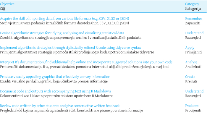
The intended learning outcomes involved the learning objectives listed inTable 1, which cover all six categories of Bloom’s revised taxonomy (Anderson and Krathwohl 2001): remember, understand, apply, analyse, evaluate, and create.
Table 1: Learning objectives and categorisation according to Bloom's revised taxonomy (Anderson and Krathwohl 2001). / Tablica 1. Ciljevi učenja i kategorizacija prema Bloomovoj revidiranoj taksonomiji (Anderson and Krathwohl 2001).
5 Syllabus
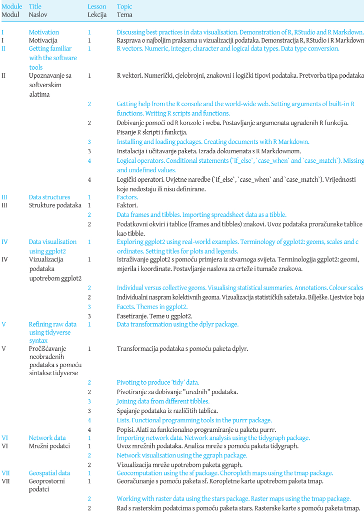
The learning objectives inTable 1 were translated into a core syllabus with seven modules:
Motivation
Getting familiar with the software tools
Data structures
Visualising data using ggplot2
Refining raw data using tidyverse syntax
Network data
Geospatial data
Each of these modules was covered over one to four lessons, as indicated inTable 2. Module I involved a class discussion on the purpose of data visualisation and best practices, using examples from the media. Afterwards, each lesson began with a brief class discussion on a data visualisation example selected by the students. Starting from the introduction of R Markdown in Lesson 3 of Module II, students were able to copy and paste ggplot2 code into their own documents. However, lessons on how to create plots with ggplot2 only commenced in Module IV after students had acquired solid foundations in R and R Markdown.
Table 2: Core syllabus. Each lesson lasted for 110 minutes. / Tablica 2. Temeljni nastavni plan i program. Svaki je sat trajao 110 minuta.
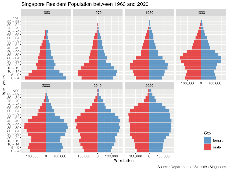
Module V returned to technical content about the R language, enabling students to develop visualisation projects based on untidy data, as typically encountered in real-world data sets. For instance, one assignment during Module V required students to download data from theDepartment of Statistics Singapore (2022) and create a sequence of population pyramids as shown inFigure 1. In addition to faceting, which was already covered in Module IV, students had to apply several dplyr operations (e.g. pivoting) to transform raw data into the final plot. The steps were outlined in the assignment, but students had to write their own code.
Figure 1: Sample visualisation to be created by students during Module V: a sequence of pyramid plots based on Singapore census data. / Slika 1. Uzorak vizualizacije koji će izraditi studenti tijekom Modula V: niz piramidalnih dijagrama temeljen na podatcima popisa stanovništva u Singapuru.
Modules VI and VII dealt with data that required visualisation tools beyond ggplot2: the tidygraph and ggraph packages for network data, and sf, stars and tmap for geospatial data. Although networks and maps are essential for data analytics, Modules VI and VII can be omitted if time is limited.
In a 13-week semester, the core syllabus left enough time to add more topics at the end. Over the years, I have covered the following topics:
Ternary plots
Three-dimensional plots
Integration of graphics (e.g. sparklines) into tables
Text analysis and word clouds
Interactive plots with zooming, panning and infotips
Animations
Web applications using the Shiny package
If time permits, another option is to expand Module VII to include more types of thematic maps (e.g. dasymetric maps or cartograms), maps of geospatial networks (e.g. roads or public transport) or web-based maps (e.g. using ggmap or leaflet). In later versions of the course, students also had the opportunity to work on a self-selected topic during their team project; among their choices were financial charts using quantmod and publication-ready plots using ggpubr. Alternatively, the course could cover literature on the psychophysics of data visualisation (e.g.Brewer 1994) and have teams of students conduct small-scale experiments (e.g. to compare the effectiveness of different colour palettes) using classmates as participants. In that case, a course on experimental design may be necessary as a prerequisite.
Reading material for the course were the books byWickham (2016) for Module IV and byWickham and Grolemund (2017) for Module V. For all other modules, I provided self-written reading materials to the students. I am currently collating my materials for publication as a textbook.
6 Pedagogy
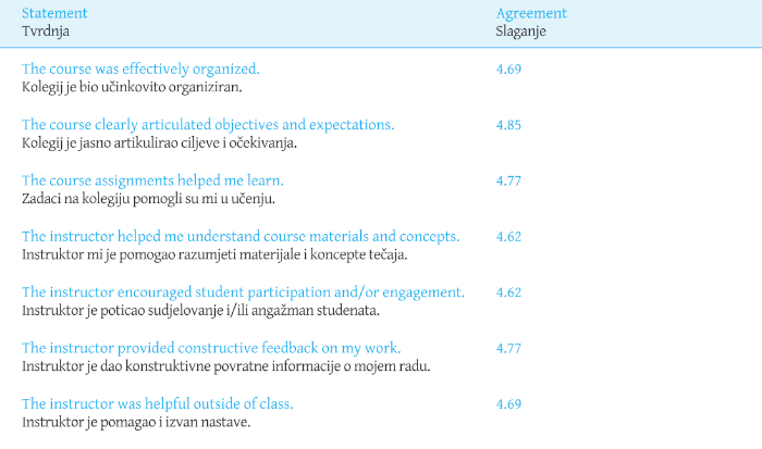
In line with the emphasis on student-student and student-faculty interaction in liberal arts education (Blaich et al. 2004), in-class exercises were integrated into the design of ‘Data Analysis and Visualisation’ to encourage collaboration and engagement. During the early stages of course development, lectures provided support and structure for the in-class exercises. However, based on student feedback, subsequent iterations gradually shifted away from lecturing towards more hands-on activities and a ‘flipped classroom’ pedagogy (Mok 2014). This approach involved students reading or watching preparatory materials and taking an online multiple-choice quiz before attending class, freeing up nearly the entire 110-minute class period for discussions and activities. The students responded positively to this teaching style, rating it 4.6 or higher out of 5 on all criteria tested in the course evaluation (Table 3).
Table 3: Final course evaluations of 'Data Analysis and Visualisation' using a 5-point Likert scale (1 = Strongly Disagree, 5 = Strongly Agree). / Tablica 3. Završne ocjene kolegija "Analiza podataka i vizualizacija" upotrebom Likertove ljestvice od 5 stupnjeva (1 = uopće se ne slažem, 5 = u potpunosti se slažem).
Before the COVID-19 pandemic, the pedagogy also incorporated elements of team-based learning (Michaelsen and Sweet 2008), with students forming fixed teams of 4 to 6 for the entire semester. Each team consisted of a mix of Singaporean and foreign students, males and females, and students with varying levels of experience. They worked together on application exercises, in-class quizzes and an end-of-semester project. To fairly assess individual contributions, anonymous peer evaluations of teammates were conducted at the end of the semester. Scores within each team and given by each team member were standardised to disincentivise giving equal scores to everybody or excessively high or low scores.
Early student feedback indicated a positive attitude towards the implemented team-based learning elements. The class environment was perceived as cooperative, with weaker students receiving guidance from stronger ones and stronger students deepening their understanding by explaining their methods to weaker students.
Safe distancing measures due to the COVID-19 pandemic presented challenges for in-class teamwork. Furthermore, some foreign students were unable to attend in person because of travel restrictions, which made collaboration on coding difficult. Although a cloud-based real-time collaborative editing environment (RStudio Workbench) was available, it was slow when used by multiple students simultaneously. Additionally, students experienced anxiety caused by the pandemic and the premonition of the college’s closure. Under these conditions, they were easily frustrated by low scores on the ‘individual readiness assurance test’, which started each lesson, following recommended team-based learning practices (Michaelsen and Sweet 2008). To address this issue, the last iteration of the course converted the readiness assurance tests to individual online quizzes with multiple answer attempts, reducing student anxiety and freeing up class time for discussions and hands-on activities.
Peer review within teams was an additional source of anxiety for students who were absent due to illness or travel restrictions because they feared that their teammates might rate their contributions unfairly. In response, peer review was eliminated in the final version of the course. However, this modification led to complaints about unequal contributions to team assignments. Based on this experience, I concur withCestone et al. (2008) that peer review is important for courses involving substantial teamwork, but students must be prepared for giving and receiving feedback.
7 Assessment
The course assessment weighed individual and team contributions approximately in a 2:1 ratio. The following list is representative of the grading scheme in later offerings of the course:
- 10%: Individual readiness assurance test
- 10%: Peer assessment by teammates
- 5%: Participation I: Visit to office hour
- 5%: Participation II: Written suggestions for improvements of reading materials
- 15%: Midterm exam
- 20%: Final exam
7.1 Readiness Assurance Tests
To prepare for each lesson, students had to complete a reading assignment and, occasionally, a video tutorial. To assess their understanding, they took a closed-book, 10-minute ‘individual readiness assurance test’ (IRAT) in the form of a multiple-choice quiz with five questions. In the first offering of the course, responses were collected in class using clickers. In the next three offerings, the team-based learning software InteDashboard was used instead, and the IRAT was immediately followed by a ‘team readiness assurance test’ (TRAT), as recommended by (Michaelsen and Sweet 2008). Teams had to agree on a single answer and, then, received feedback on whether they had the correct answer. If not, teams were permitted to retake the question for a reduced score.
The TRATs promoted lively discussions among team members. However, when questions were complex, teams often resorted to guessing, leading to additional class time spent on explanations of edge cases or obscure features of R. As a result, the final offering of the course made changes to the assessment process. All IRATs were moved to before class, TRATs were dropped, and the questions were simplified. The time gained at the start of each lesson was instead used for a class discussion about a student-selected example of data visualisation in the media.
7.2 Application Exercises
After the TRAT or class discussion, teams were given exercises to apply what they had read before class. As common in liberal arts colleges, the average number of students per section was only around 20, which allowed me to visit each team and answer questions while they were working on the problems.
As the course matured, each application exercise was structured around a coherent narrative but divided into 3 to 4 separate handouts. The first handout introduced the topic and included the first few tasks; the second handout showed the same text as the first one but added more tasks, and so on. Before distributing the next handout to all teams, I briefly paused to give them the opportunity to ask me or other teams for help. The complete problem set was released near the end of the lesson, and each team was required to submit written solutions within one week. In the final offering of the course, I gave summative feedback on solutions after odd-numbered lessons, and each team provided formative feedback to another randomly assigned team after even-numbered lessons. Teams were given rubrics for the formative feedback and received marks for completing the review.
7.3 Final Team Project
For the final project, each team chose an R visualisation package not included in the core syllabus. The aim was to explain the features of the package in a short self-written tutorial and accompanying application exercise, given to another randomly assigned team. For clarity, the authoring team will be referred to as ‘Team A’ and the recipient team as ‘Team B’. All teams had to play both roles in parallel. Team A had to send the tutorial to Team B several days before the last class to allow sufficient time for reading. The exercise was then received by Team B at the start of the class, with 45 minutes allotted for completion. Before the class ended, Team A had to provide a sample solution and feedback on Team B’s solution attempt. Afterwards, all students in Team B had to submit individual responses to a questionnaire evaluating the tutorial, exercise, sample solution and feedback provided by Team A. Scores and comments were communicated to Team A in an anonymised and aggregated form.
The intended learning outcomes of the final project were as follows:
Understanding of an R package not covered elsewhere in the course
Contextualisation and presentation of the package
Comparison and evaluation of different graphics and visualisation software tools
Documentation and explanation of R code using R Markdown
Provision of professional guidance for problem-solving
Final projects were assessed using the criteria inTable 4, with the students’ feedback from the questionnaire considered. Extreme responses were given less weight during moderation to ensure a balanced evaluation.
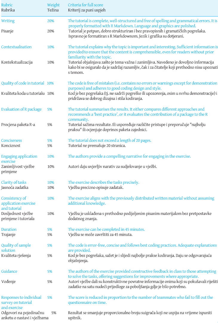
Table 4: Rubrics for final team project. / Table 4. Rubrics for final team project
The final project was intended to be the culmination of the semester, where students could display mastery of the course content by taking on the role of the instructor for one lesson. A faculty observer noted about the final project in a summative assessment of the course: ‘The students were active and engaged throughout the session. Moreover, the team aspect of the class felt fully integrated into the larger pedagogy, rather than tacked on as an afterthought’ (Wertz 2022).
8 Samples of Visualisations Used in Exercises
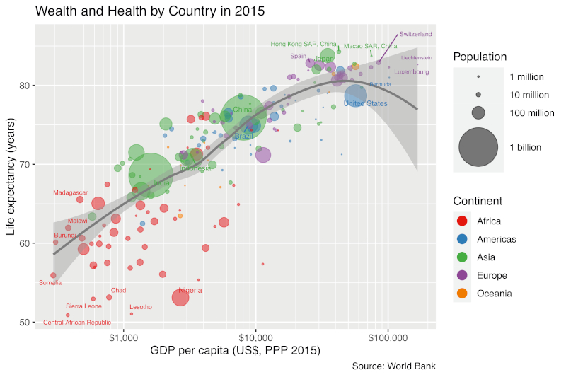
Figure 2 shows a visualisation that students had to produce as a solution to a team exercise in Module IV. The objective was to ‘Practise your ggplot2 skills by creating a bubble plot comparable to the plot of life expectancy versus gross domestic product (GDP) byGapminder (2016)’. The data was sourced from theWorld Bank’s (2022) website.
Figure 2: Sample visualisation to be created by students in Module IV: a bubble chart of life expectancy versus gross domestic product by country. / Slika 2. Primjer vizualizacije koju će izraditi studenti u modulu IV: grafikon s mjehurićima očekivanog životnog vijeka u odnosu na bruto domaći proizvod po zemlji.
In Module IV, students received preprocessed data because they had not yet been introduced to the dplyr package. In an assignment during Module V, they were given hyperlinks to the World Bank’s data sets and had to bring the data into the format given to them in Module IV using dplyr.
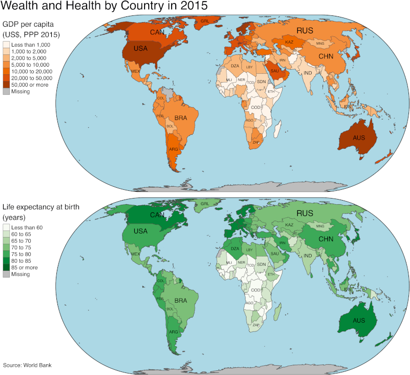
In Module VII, the objective was to visualise the same data in a two-panel plot, each containing a choropleth map, as shown inFigure 3. That assignment was scaffolded as ten tasks that guided students from the results of the exercises in Modules IV and V to the final plot. Among the tasks was the selection of suitable colour palettes from Colorbrewer2 (Harrower and Brewer 2003) and applying an equal-area map projection (in this example: Eckert IV).
Figure 3: Sample visualisation to be created by students in Module VII: a two-panel plot, each containing a choropleth map. / Slika 3. Primjer vizualizacije koju će izraditi studenti u modulu VII: dijagram na dvama crtežima od kojih svaki sadrži koropletnu kartu.
For the last two tasks, students had to answer the following questions:
(9) What can a reader conclude from the maps?
(10) What are the advantages and disadvantages of this visualisation in comparison toFigure 2?
In response to Task (9), teams were expected to comment on geographic trends (e.g. most countries that are poor and have a short average life expectancy are in central Africa). Most teams also pointed out the positive correlation between per-capita GDP and average life expectancy. In response to Task (10), they noted that detecting the correlation from the bubble plot inFigure 2 is easier than from the two-panel map inFigure 3, which requires viewers to shift their gaze from one panel to the other. Teams also commented that the maps inFigure 3 have the advantage of showing precisely where countries are located, whereas the colours inFigure 2 only indicate continents and, thus, coarse-grained locations. As a disadvantage ofFigure 3, teams pointed out that exact values for per-capita GDP and life expectancy cannot be retrieved from the discretised colour palette, in contrast to the continuous spatial coordinates inFigure 2. In general, team responses indicated that students had become thoughtful consumers and producers of data visualisation at this stage of the course.
9 Conclusions
Liberal arts education aims at imparting broad knowledge and critical thinking through active learning. Students should be able to reflect on whether visualisation is an appropriate method of communicating a given data set. If yes, they should consider which visualisation will be most effective. They should also know the established ‘best practices’ and the reasons for them. Still, students should feel comfortable deviating from established practices when they can be replaced by a better alternative. Many widespread data visualisation software tools stifle creativity by offering only a limited set of possible charts, sending the wrong message that data visualisation is tantamount to choosing from a small catalogue of chart types. By contrast,Wilkinson’s (2005) grammar of graphics and its implementation by the R package ggplot2 enable students to produce complex and creative visualisations. Therefore, this article advocates that a substantial part of class time should be devoted to learning ggplot2 or similar packages in other programming environments hands-on. R has the advantage of providing additional software packages (e.g. tmap and sf) that extend the grammar of graphics and tidyverse syntax to geospatial data, but Python and Julia are quickly closing the gap.
The assignments described here were developed for a relatively small class size of around 20 students. If classes are larger, instructors must rely more strongly on code review by peers to compensate for reduced personal interaction with students. In that case, teaching assistants should also be employed to interact with students in class, as suggested byRuder and Stanford (2018). Nevertheless, the core syllabus inTable 2 is also applicable to larger classrooms. Therefore, I hope that the suggestions in this article will contribute a new facet to the education in data visualisation even outside the setting of a liberal arts college.
Acknowledgements
The author expresses his gratitude to Jon Berrick, Tim Wertz, Adi Singhania and two anonymous referees for comments on an early version of this manuscript. Feedback on pedagogy, assessment and assignments by Catherine Sanger, Simon T. Perrault, Ilya Sergey and Neil Clarke is also gratefully acknowledged. This project is supported by the Ministry of Education, Singapore, under its Academic Research Fund Tier 2 (EP2) programme (Award No. MOE-T2EP20221-0007). Any opinions, findings and conclusions or recommendations expressed in this material are those of the author and do not reflect the views of the Ministry of Education, Singapore.
1. Uvod
Vizualizacija podataka grafički je prikaz informacija i podataka (Bikakis 2019). To je koristan alat jer je "ljudski vizualni sustav tragač za uzorcima goleme moći i suptilnosti" (Ware 2021, xiv). Važnost vizualizacije podataka prepoznata je u područjima kao što su poslovanje i financije (Solis 2019), medicina i zdravstvo (Park i dr. 2022), novinarstvo i mediji (Engebretsen 2020), javna politika (Raineri i Molinari 2021) i planiranje zaštite okoliša (Metze 2020). Sukladno tome, vizualizacijska je pismenost opisana kao "ključna za potporu kogniciji i razvija se prema informiranijem društvu" (Firat i dr. 2022, 99).
Many definitions of visualisation literacy highlight the capability to read, interpret and extract information from visual representations of data (Boy et al. 2014;Börner et al. 2016;Lee et al. 2017). This set of skills is analogous to reading comprehension, which is a requirement but not a synonym for textual literacy. To be considered literate in a language, an individual must also be able to speak fluently and create meaningful written documents. Similarly, visualisation literacy is not solely determined by the ability to read and understand statistical charts but also by the capacity to produce one’s own meaningful graphical displays.
Kao odgovor na sve veću potrebu za vizualizacijskom pismenošću u ovom širem smislu, koledži i sveučilišta diljem svijeta nude tečajeve vizualizacije podataka kao dio svojih studijskih programa ili za kontinuirano obrazovanje stručnjaka, poput tečaja koji opisujeChiera (2017).
Yale-NUS College, koji je bio prvi singapurski koledž liberalnih vještina, imao je vlastiti kolegij "Analiza podataka i vizualizacija". Liberalno obrazovanje ima za cilj njegovati intelektualnu otvorenost kod studenata (Blaich i dr. 2004). Da bi ispunili taj cilj, Yale-NUS College i mnogi drugi koledži za slobodne vještine zahtijevaju od studenata da pohađaju kolegije iz humanističkih, društvenih i prirodnih znanosti umjesto da se rano usredotoče na jedan predmet. Stoga sam, kao inicijator i voditelj razvoja "Analize podataka i vizualizacije", imao za cilj stvoriti interdisciplinarni tečaj koji potiče kreativno računalno razmišljanje uključujući osnovno razumijevanje vizualizacije geoprostornih podataka. Kartografske vještine, prenesene studentima kroz praktične zadatke izrade karte, sadržavale su sposobnost odabira prikladnih kartografskih projekcija, odabira odgovarajućih kartografskih znakova i stvaranja učinkovitih tumača znakova. Predmet se predavao pet puta između 2016. i 2022. godine. Međutim, nakon najave zatvaranja Yale-NUS College (Nacionalno sveučilište u Singapuru 2021,The Economist 2021), napravljene su značajne promjene u izvornoj strukturi kurikuluma koledža, što je rezultiralo ukidanjem predmeta "Analiza podataka i vizualizacija". Svrha je ovoga članka dokumentirati uvide i iskustva stečena uključivanjem vizualizacije podataka u obrazovanje slobodnih vještina dok je Yale-NUS College još bio operativan.
2. Što su drugi pisali o toj temi
Dok poslovni stručnjaci predviđaju da će studenti liberalnih vještina uskoro biti traženi za poslove vizualizacije podataka (Clayton 2016;Hillery 2019), malo je nastavnika pisalo o pedagoškim aspektima tečajeva vizualizacije podataka posebno skrojenih za koledže liberalnih vještina.
Owen i dr. (2013) raspravljali su o tečaju "Vizualizacija: podatci, pikseli i ideje" na Sveučilištu Yale (SAD) kao primjeru tečaja osmišljenog za obrazovanje slobodnih vještina. Budući da su studenti dolazili iz različitih obrazovnih sredina, programiranje nije bilo preduvjet. Međutim, tečaj je koristio razne softverske alate, uključujući Excel, Matlab i preglednik Virtual Reality Modeling Language. Prijave su se uglavnom temeljile na skupovima podataka iz humanističkih znanosti (npr. politika ili povijest). Kao primjer prijave,Owen i dr. (2013) pokazali su digitaliziranu povijesnu kartu Dublina ističući georeferencirane događaje u romanu Jamesa Joycea "Uliks".
Myers je (2021) opisao sličan projekt koristeći izradu karata u humanističkim znanostima. Za kolegij o drevnim putovanjima, geografiji i etnografiji na Kenyon Collegeu (SAD) studenti su radili na projektu pod nazivom "Kartiranje Ciceronovih pisama". Tijekom projekta studenti su identificirali imena mjesta koja se spominju u Ciceronovim pismima, pohranili podatke (npr. geografsku širinu i dužinu) u proračunske tablice Microsoft Excela i s pomoću web aplikacije Carto izradili digitalne vizualizacije.
U prirodnim je znanostimaSharma (2017) opisao model tečaja znanstvenog računarstva na Wagner Collegeu (SAD). Nastavni plan i program sadržavao je osnovne statističke grafikone (npr. stupčaste dijagrame i histograme) koje je izradila Mathematica i molekularnu vizualizaciju koju je izradio softver otvorenog koda Avogadro.Sharma (2017) tvrdi da bi koledži liberalnih vještina trebali rutinski nuditi slične tečajeve kako bi se poboljšala tehnološka kompetencija studenata i izgledi za karijeru.
Da bi razumio povjerenje studenata i nastavnika u vlastitu tehnološku kompetenciju,Kumar je (2020) analizirao podatke iz polustrukturiranih intervjua u Symbiosis School for Liberal Arts (Indija). Studenti su se žalili na nedostatak obrazovanja o softveru za vizualizaciju podataka (npr. Tableau), dok su nastavnici smatrali da im nedostaje stručnost za podučavanje u tom području. Da bi se situacija poboljšala,Kumar je (2020) preporučio da Symbiosis School za studente i nastavno osoblje ponudi više praktične obuke.
3. Izbor softvera
S obzirom na važnost praktične obuke, prilikom planiranja tečaja vizualizacije podataka ključno je odabrati odgovarajuće softversko okruženje.
Programe za proračunske tablice (npr. Excel ili Google Sheets) lako je naučiti. Međutim, njihove su karte ograničene na samo nekoliko stiardnih tipova i teško ih je prilagoditi. Aplikacije s grafičkim korisničkim sučeljima (npr. Tableau ili Qlik) nude više mogućnosti prilagodbe za grafikone, ali njihovo korištenje za algoritamsku izradu grafikona nije jednostavno. Trenutačne verzije geoinformacijskih sustava (npr. ArcGIS i QGIS) omogućuju algoritamsku kontrolu upotrebom skripti Pythona. Međutim, ti su sustavi prvenstveno dizajnirani za izradu karata, a ne općih statističkih grafikona. Alternativa je izravna uporaba programskih jezika opće namjene kao što su Python, R ili Julia. Ta su tri jezika besplatna, otvorenoga koda i neovisna o platformi, a svaki od njih ima specijalizirane pakete za vizualizaciju podataka (npr. Pythonov matplotlib) koji mogu proizvesti grafikone profesionalne kvalitete.
Za "Analizu podataka i vizualizaciju" R je bio konačni izbor programskog jezika iz sljedećih razloga:
R naširoko koriste znanstvenici koji se bave podatcima. Stoga učenje R može dovesti do atraktivnih mogućnosti zapošljavanja studenata nakon diplome.
Kolekcija R paketa "tidyverse" ima dosljednu sintaksu jednostavnu za upotrebu i širok raspon paketa za različite zadatke iz znanosti o podatcima, od uvoza i čišćenja podataka do vizualizacije i modeliranja.
Temeljni vizualizacijski paket u tidyverseu, ggplot2 (Wickham 2016), primjena jeWilkinson’s (2005) "gramatike grafike". Gramatika pruža dosljedan i strukturiran pristup vizualizaciji podataka koji naglašava temeljna načela umjesto pamćenja određenih vrsta grafikona, kao što su raspršeni dijagrami ili dijagrami pravokutnika (box plots).
Dodatni paket sf (Pebesma 2018) omogućuje napredno georačunanje s pomoću R-a (Lovelace i dr. 2019). Još jedan dodatni paket, tmap (Tennekes 2018), pojednostavljuje stvaranje tematskih karata proširujućiWilkinson’s (2005) gramatiku.
Preduvjetni tečaj "Kvantitativno rasuđivanje" podučavao je osnovne elemente R-a upotrebom integriranog razvojnog okruženja RStudio koje pruža korisničko sučelje za pisanje, izvođenje i dokumentiranje R koda. RStudio također podržava R Markdown, format dokumenta koji kombinira tekst, R kod i izlaze koda (npr. crteže) u jedan dokument. Kao dio zadaća na kolegiju studenti su morali predati R Markdown kod, zajedno s renderiranim dokumentom u PDF-u ili HTML-u.
Instruktori koji su bolje upoznati s Pythonom nego s R-om mogu razmotriti upotrebu Pythonova paketa plotnine (Kibirige i dr. 2022) koji emulira sintaksu ggplot2. Slično tome, Julia paket Gadfly.jl jl (Jones i dr. 2021), koji je pod velikim utjecajem ggplot2, omogućuje promjenu programskog jezika s R na Julia. Međutim, Gadfly.jl je još uvijek nov, stoga još ne nudi istu funkcionalnost kao ggplot2. Nadalje, od zadnje je ponude "Analize podataka i vizualizacije" R Markdown zamijenjen Quartom koji podržava kod napisan u jezicima R, Python i Julia. Stoga se bilo koji od tih triju programskih jezika sada može upotrebljavati kao osnova za tečaj.
4. Ciljevi učenja
"Analiza podataka i vizualizacija" osmišljena je za studente druge godine Yale-NUS Collegea. Studenti se prije nisu susreli s ggplot2 i sintaksom tidyverse, stoga je "Analiza podataka i vizualizacija" trebala poučavati ove teme na samostalan način. Cilj je bio nadgraditi prethodno znanje studenata o R-u i pružiti im alate za prikazivanje podataka iz stvarnog svijeta iz različitih disciplina na informativan, elegantan i strukturiran način. Kako bi pripremili studente za njihove karijere nakon diplome i potaknuli kritičko razmišljanje o vlastitom kodu i zapletima, od njih se očekivalo da potraže pomoć na internetu i kritiziraju radove drugih studenata. Predviđeni su ishodi učenja sadržavali ciljeve učenja navedene u intablici 1, a koji pokrivaju svih šest kategorija Bloomove revidirane taksonomije (Anderson i Krathwohl 2001): zapamtiti, razumjeti, primijeniti, analizirati, procijeniti i stvoriti.
5. Nastavni plan i program
Ciljevi učenja utablici 1 prevedeni su u temeljni nastavni plan i program sa sedam modula:
Motivacija
Upoznavanje sa softverskim alatima
Strukture podataka
Vizualizacija podataka pomoću ggplot2
Pročišćavanje neobrađenih podataka s pomoću sintakse tidyverse
Mrežni podatci
Geoprostorni podatci
Svaki je od tih modula obuhvaćao od jedne do četiri lekcije, kao što je naznačeno utablici 2. Modul I sadržavao je raspravu o svrsi vizualizacije podataka i najboljim praksama koristeći primjere iz medija. Nakon toga, svaka je lekcija započela kratkom raspravom o primjeru vizualizacije podataka koji su odabrali studenti. Počevši od uvoda R Markdowna u Lekciji 3 Modula II, studenti su mogli kopirati i zalijepiti ggplot2 kod u vlastite dokumente. Međutim, lekcije o tome kako izraditi dijagrame pomoću ggplot2 započele su tek u Modulu IV nakon što su studenti stekli solidne temelje u R-u i R Markdownu.
Modul V vratio se tehničkom sadržaju o jeziku R omogućujući studentima da razviju projekte vizualizacije temeljene na neurednim podatcima kakvi se obično susreću u skupovima podataka iz stvarnog svijeta. Na primjer, jedan zadatak tijekom modula V zahtijevao je od studenata da preuzmu podatke izOdjela za statistiku Singapura (2022) i kreiraju niz populacijskih piramida kao što je prikazano naslici 1. Uz fasetiranje, koje je već obrađeno u Modulu IV, studenti su morali primijeniti nekoliko operacija dplyr (npr. pivotiranje) kako bi transformirali neobrađene podatke u konačni dijagram. Koraci su bili navedeni u zadatku, ali su studenti morali napisati vlastiti kod.
Moduli VI i VII bavili su se podatcima koji zahtijevaju alate za vizualizaciju izvan ggplot2: paketi tidygraph i ggraph za mrežne podatke, te sf, stars i tmap za geoprostorne podatke. Iako su mreže i karte ključni za analitiku podataka, moduli VI i VII mogu se izostaviti ako je vrijeme ograničeno.
U semestru od 13 tjedana temeljni je nastavni plan ostavio dovoljno vremena za dodavanje više tema na kraju. Tijekom godina bavio sam se sljedećim temama:
Trokutasti grafikoni
Trodimenzionalni crteži
Integracija grafike (npr. sparkline) u tablice
Analiza teksta i oblaci riječi
Interaktivni crteži sa zumiranjem, pomicanjem i informativnim savjetima
Animacije
Web aplikacije koje koriste paket Shiny
Ako vrijeme dopušta, druga je mogućnost proširiti Modul VII kako bi sadržavao više vrsta tematskih karata (npr. dasimetrijske karte ili kartogrami), karte geoprostornih mreža (npr. ceste ili javni prijevoz) ili karte temeljene na webu (npr. pomoću ggmapa ili letka). U kasnijim verzijama tečaja studenti su također imali priliku raditi na temi koju su sami odabrali tijekom svog timskog projekta; među njihovim su izborima bili financijski grafikoni koji koriste quantmod i crteži spremni za objavljivanje s pomoću ggpubra. Alternativno, kolegij bi mogao pokriti literaturu o psihofizici vizualizacije podataka (npr.Brewer 1994) i imati timove studenata koji će provoditi manje eksperimente (npr. za usporedbu učinkovitosti različitih paleta boja) koristeći kolege kao sudionike. U tom bi slučaju kolegij o eksperimentalnom dizajnu mogao biti neophodan preduvjet.
Materijal za lektiru za kolegij bile su knjigeWickhama (2016) za modul IV iWickhama i Grolemunda (2017) za modul V. Za sve sam ostale module studentima osigurao materijale za čitanje koje su sami napisali. Trenutačno prikupljam svoje materijale za objavljivanje udžbenika.
6. Odgojno-obrazovni proces
U skladu s naglaskom na interakciju student - student i student - nastavnik u obrazovanju slobodnih vještina (Blaich i dr. 2004), vježbe na nastavi integrirane su u dizajn "Analize podataka i vizualizacije" kako bi se potaknula suradnja i angažman. Tijekom ranih faza razvoja kolegija predavanja su pružala podršku i strukturu za vježbe u nastavi. Međutim, na temelju povratnih informacija studenata, naknadne su se iteracije postupno udaljile od predavanja prema više praktičnih aktivnosti i pedagogiji "okrenute učionice (flipped classroom)" (Mok 2014). Pri tom su pristupu studenti čitali ili gledali pripremne materijale i prije pohađanja nastave rješavali online kviz s višestrukim odgovorima omogućujući tako da gotovo cijeli sat od 110 minuta bude slobodan za rasprave i aktivnosti. Studenti su pozitivno odgovorili na taj stil poučavanja ocijenivši ga ocjenom 4,6 ili više od maksimalno 5 prema svim kriterijima testiranima u evaluaciji kolegija (tablica 3).
Prije piemije COVID-19 odgojno-obrazovni proces je također sadržavao elemente timskog učenja (Michaelsen i Sweet 2008) sa studentima koji su formirali fiksne timove od 4 do 6 osoba za cijeli semestar. Svaki se tim sastojao od mješavine singapurskih i stranih studenata, muškaraca i žena, te studenata s različitim razinama iskustva. Zajedno su radili na vježbama primjene, kvizovima u nastavi i projektu na kraju semestra. Kako bi se pravedno procijenio pojedinačni doprinos, na kraju semestra provedeno je anonimno ocjenjivanje suigrača. Ocjene unutar svakog tima, koje je dao svaki član ekipe, stiardizirane su kako bi se destimuliralo davanje jednakih bodova svima ili pretjerano visoke ili niske ocjene.
Prve povratne informacije studenata pokazale su pozitivan stav prema primijenjenim elementima timskog učenja. Razredno je okruženje percipirano kao suradničko, pri čemu su slabiji studenti dobivali smjernice od boljih, a bolji su studenti produbljivali svoje razumijevanje objašnjavajući svoje metode slabijim studentima.
Mjere sigurnog distanciranja zbog piemije COVID-19 bile su izazov za timski rad. Nadalje, neki strani studenti nisu mogli osobno prisustvovati zbog ograničenja putovanja, što je otežavalo suradnju na kodiranju. Iako je okruženje za suradničko uređivanje u stvarnom vremenu temeljeno na oblaku (RStudio Workbench) bilo dostupno, bilo je sporo kada ga je istovremeno koristilo više studenata. Dodatno, studenti su iskusili tjeskobu uzrokovanu piemijom i predosjećajem zatvaranja koledža. U tim su uvjetima lako bili frustrirani slabim rezultatima na "testu osiguranja individualne spremnosti" kojim je započinjao svaki sat slijedeći preporučene timske prakse učenja (Michaelsen i Sweet 2008). Kako bi se riješio taj problem, posljednja je iteracija kolegija pretvorila testove osiguranja spremnosti u pojedinačne online kvizove s višestrukim pokušajima odgovora smanjujući anksioznost studenata i oslobađajući vrijeme nastave za rasprave i praktične aktivnosti.
Stručno ocjenjivanje unutar timova bilo je dodatni izvor tjeskobe za studente koji su izostajali zbog bolesti ili ograničenja putovanja jer su se bojali da bi njihovi timski kolege mogli nepravedno ocijeniti njihov doprinos. Kao odgovor na to, recenziranje je eliminirano u konačnoj verziji kolegija. Međutim, ta je izmjena dovela do pritužbi o nejednakom doprinosu timskim zadacima. Na temelju ovog iskustva, slažem se sCestoneom i dr. (2008) da je kolegijalno ocjenjivanje važno za predmete koji uključuju značajan timski rad, ali studenti moraju biti spremni na davanje i primanje povratnih informacija.
7. Ocjenjivanje
Ocjenjivanje tečaja vagalo je pojedinačne i timske doprinose otprilike u omjeru 2 : 1. Sljedeći je popis reprezentativan za shemu ocjenjivanja u kasnijim ponudama tečaja:
- 10%: Individualni test osiguranja spremnosti
- 10%: Procjena kolega iz tima
- 5%: Sudjelovanje I: Dolazak na satove kolegija
- 5%: Participation II: Pisane primjedbe za poboljšanje nastavnih materijala
- 15%: Međuispit
- 20%: Konačni ispit
7.1. Testovi osiguranja spremnosti
Da bi se pripremili za svaku lekciju, studenti su morali pročitati zadano i, povremeno, pogledati videolekciju. Da bi procijenili svoje razumijevanje, pristupali su 10-minutnom individualnom testu osiguranja spremnosti (individual readiness assurance test − IRAT) u obliku kviza od pet pitanja višestrukog izbora. U prvoj su ponudi kolegija odgovori prikupljani u razredu. U sljedećim trima ponudama umjesto toga je korišten softver za timsko učenje InteDashboard, a nakon IRAT-a, prema preporuci (Michaelsena i Sweeta 2008)., odmah je uslijedio test osiguranja spremnosti tima (team readiness assurance test − TRAT).
Timovi su se morali složiti oko pojedinog odgovora, a zatim su dobili povratnu informaciju o tome je li odgovor bio točan. Ako nije, timovima je bilo dopušteno ponovno rješavati pitanje za smanjeni rezultat.
TRAT-ovi su poticali živahne rasprave među članovima tima. Međutim, kada su pitanja bila složena, timovi su često pribjegavali pogađanju, što je dovelo do dodatnog vremena provedenog u razredu na objašnjenja rubnih slučajeva ili opskurnih značajki R-a. Kao rezultat toga, konačna je ponuda kolegija unijela promjene u proces ocjenjivanja. Svi IRAT-ovi su premješteni prije nastave, TRAT-ovi su izbačeni, a pitanja su pojednostavljena. Vrijeme dobiveno na početku svake lekcije umjesto toga iskorišteno je za raspravu o primjeru vizualizacije podataka u medijima koji su odabrali studenti.
7.2. Vježbe primjene
Nakon TRAT-a ili rasprave, timovi su dobili vježbe za primjenu onoga što su pročitali prije nastave. Kao što je uobičajeno na koledžima slobodnih vještina, prosječan je broj studenata po sekciji bio oko 20, što mi je omogućilo da posjetim svaki tim i odgovorim na pitanja dok rade na problemima. Kako je kolegij sazrijevao, svaka je vježba za primjenu bila strukturirana oko koherentnog narativa, ali podijeljena u 3 do 4 odvojena materijala (hiouts). Prvi je materijal predstavljao temu i uključivao prvih nekoliko zadataka; drugi materijal je pokazao isti tekst kao prvi, ali je dodao više zadataka itd. Prije nego što sam podijelio sljedeći materijal svim timovima, nakratko sam zastao kako bih im dao priliku da zamole mene ili druge timove za pomoć. Kompletan je skup problema objavljen pred kraj lekcije, a svaki je tim trebao predati pisana rješenja unutar jednog tjedna.
U konačnoj sam ponudi kolegija dao sumirane povratne informacije o rješenjima nakon lekcija s neparnim brojevima, a svaki je tim dao formativne povratne informacije drugom nasumično dodijeljenom timu nakon lekcija s parnim brojevima. Timovi su dobili rubrike za formativne povratne informacije i dobili su ocjene za dovršetak pregleda.
7.3. Završni timski projekt
Za završni je projekt svaki tim odabrao vizualizacijski paket R-a koji nije uključen u temeljni nastavni program. Cilj je bio izraditi kratki vodič s objašnjenjem značajki paketa i popratnu vježbu s primjenom te to dati drugom nasumično dodijeljenom timu. Radi jasnoće, autorski ćemo tim nazvati Tim A, a tim primatelj Tim B. Svi su timovi morali igrati obje uloge paralelno. Tim A je morao poslati tutorial timu B nekoliko dana prije zadnjeg sata kako bi bilo dovoljno vremena za čitanje. Vježbu je zatim primio tim B na početku sata, s 45 minuta dodijeljenih za završetak. Prije završetka sata tim A je morao dati primjer rješenja i povratnu informaciju o pokušaju rješenja tima B. Nakon toga, svi su studenti u timu B morali predati pojedinačne odgovore na upitnik ocjenjujući tutorial, vježbu, primjer rješenja i povratne informacije koje je dao tim A. Rezultati i komentari priopćeni su timu A u anonimnom i zbirnom obliku.
Predviđeni ishodi učenja završnog projekta bili su sljedeći:
Razumijevanje paketa R-a koji nije obuhvaćen drugdje u tečaju
Kontekstualizacija i prezentacija paketa
Usporedba i procjena različitih grafičkih i softverskih alata za vizualizaciju
Dokumentacija i objašnjenje R koda s pomoću R Markdowna
Pružanje stručnih smjernica za rješavanje problema
Završni su projekti ocjenjivani prema kriterijima u intablici 4, uz razmatranje povratnih informacija studenata iz upitnika. Ekstremnim je odgovorima dana manja težina tijekom moderiranja kako bi se osigurala uravnotežena procjena.
Završni je rad trebao biti kulminacija semestra gdje bi studenti mogli pokazati ovladavanje sadržajem kolegija preuzimajući ulogu instruktora na jednom satu. Nastavnik promatrač primijetio je o završnom projektu u sumarnoj procjeni kolegija: "Studenti su bili aktivni i angažirani tijekom cijele sesije. Štoviše, činilo se da je timski aspekt nastave potpuno integriran u širi odgojno-obrazovni rad, umjesto da se o njemu razmišlja naknadno" (Wertz 2022).
8. Primjeri vizualizacija na vježbama
Slika 2 prikazuje vizualizaciju koju su studenti trebali izraditi kao rješenje timske vježbe u modulu IV. Cilj je bio "uvježbati svoje vještine ggplot2a stvaranjem grafikona s mjehurićima koji se može usporediti s grafikonom očekivanog životnog vijeka u odnosu na bruto domaći proizvod (BDP)Gapmindera (2016)”. Podatci su preuzeti s web straniceSvjetske banke (2022).
U modulu IV studenti su dobili prethodno obrađene podatke jer još nisu bili upoznati s paketom dplyr. U zadatku s modulom V dobili su hiperveze na skupove podataka Svjetske banke i morali su dovesti podatke u format koji im je dan u modulu IV koristeći dplyr.
U modulu VII cilj je bio vizualizirati iste podatke u dijagramu na dvama crtežima, od kojih svaki sadrži koropletnu kartu kao što je prikazano naslici 3. Taj je zadatak bio složen od deset podzadataka koji su vodili studente prema rezultatima vježbi u modulima IV i V do konačnog crteža. Među zadatcima je bio odabir prikladnih paleta boja iz Colorbrewer2 (Harrower i Brewer 2003) i primjena ekvivalentne projekcije (u ovom primjeru: Eckert IV).
Za posljednja su dva zadatka studenti trebali odgovoriti na sljedeća pitanja:
(9) Što čitatelj može zaključiti iz karata?
(10) Koje su prednosti i nedostaci ove vizualizacije u usporedbi saslikom 2?
Kao odgovor na zadatak (9) od timova se očekivalo da komentiraju geografske trendove (npr. većina zemalja koje su siromašne i imaju kratak prosječni životni vijek nalazi se u središnjoj Africi). Većina je timova također istaknula pozitivnu korelaciju između BDP-a po glavi stanovnika i prosječnog životnog vijeka.
U odgovoru na zadatak (10) primijetili su da je otkrivanje korelacije iz dijagrama s mjehurićima naslici 2 lakše nego iz karte na dvama crtežima naslici 3, a koja zahtijeva od gledatelja da prebacuju pogled s jednog crteža na drugi. Timovi su također komentirali da karte naslici 3 imaju prednost jer pokazuju točno gdje se zemlje nalaze, dok boje naslici 2 označavaju samo kontinente i, prema tome, samo grube lokacije. Kao nedostatakslici 3, timovi su istaknuli da se točne vrijednosti za BDP po glavi stanovnika i očekivani životni vijek ne mogu dohvatiti iz diskretizirane palete boja, za razliku od kontinuiranih prostornih koordinata naslici 2. Općenito, odgovori timova pokazali su da su studenti postali promišljeni potrošači i proizvođači vizualizacije podataka u ovoj fazi kolegija.
9. Zaključci
Liberalno obrazovanje vještina ima za cilj prenijeti široko znanje i razvijati kritičko razmišljanje kroz aktivno učenje. Studenti bi trebali moći donijeti zaključak o tome je li vizualizacija prikladna metoda priopćavanja određenog skupa podataka. Ako da, trebali bi razmotriti koja će vizualizacija biti najučinkovitija. Također bi trebali poznavati „najbolje prakse” i razloge za njih. Ipak, studenti bi se trebali osjećati ugodno odstupajući od ustaljenih praksi kad ih se može zamijeniti boljom alternativom. Mnogi široko rasprostranjeni softverski alati za vizualizaciju podataka guše kreativnost nudeći samo ograničen skup mogućih grafikona, šaljući pogrešnu poruku da je vizualizacija podataka jednaka odabiru iz malog kataloga vrsta grafikona. Nasuprot tome,Wilkinsonova (2005) gramatika grafike i njezina primjena s pomoću paketa ggplot2 omogućuje studentima stvaranje složenih i kreativnih vizualizacija. Stoga ovaj članak zagovara da bi značajan dio vremena u nastavi trebao biti posvećen praktičnom učenju paketa ggplot2 ili sličnih paketa u drugim programskim okruženjima. R ima prednost pružanja dodatnih softverskih paketa (npr. tmap i sf) koji proširuju gramatiku grafike i sintaksu tidyverse na geoprostorne podatke, ali Python i Julia brzo uklanjaju prazninu.
U ovom su članku opisani zadatci razvijeni za relativno malu grupu od oko 20 studenata. Ako su grupe veće, instruktori se moraju više oslanjati na studente za pregledavanje koda kako bi nadoknadili smanjenu osobnu interakciju sa studentima. U tom bi slučaju također trebali biti angažirani pomoćnici u nastavi za interakciju sa studentima, kao što predlažuRuder i Stanford (2018). Unatoč tome, temeljni nastavni plan i program utablici 2 primjenjiv je i na veće grupe studenata. Nadam se, stoga, da će prijedlozi u ovom članku pridonijeti novom aspektu obrazovanja o vizualizaciji podataka čak i izvan okruženja koledža slobodnih vještina.
Zahvale
Autor izražava zahvalnost Jonu Berricku, Timu Wertzu, Adiju Singhaniji i dvama anonimnim recenzentima za komentare na prvu verziju ovog rukopisa. Također zahvaljujem na povratnim informacijama o odgojno-obrazovnom procesu, ocjenjivanju i zadatcima Catherine Sanger, Simonu T. Perraultu, Ilyi Sergeyu i Neilu Clarkeu. Ovaj projekt podržava Ministarstvo obrazovanja Singapura u okviru svog programa Fonda za akademska istraživanja Tier 2 (EP2) (nagrada br. MOE-T2EP20221-0007). Sva mišljenja, nalazi i zaključci ili preporuke izraženi u ovom materijalu pripadaju autoru i ne odražavaju stajališta Ministarstva obrazovanja Singapura.
